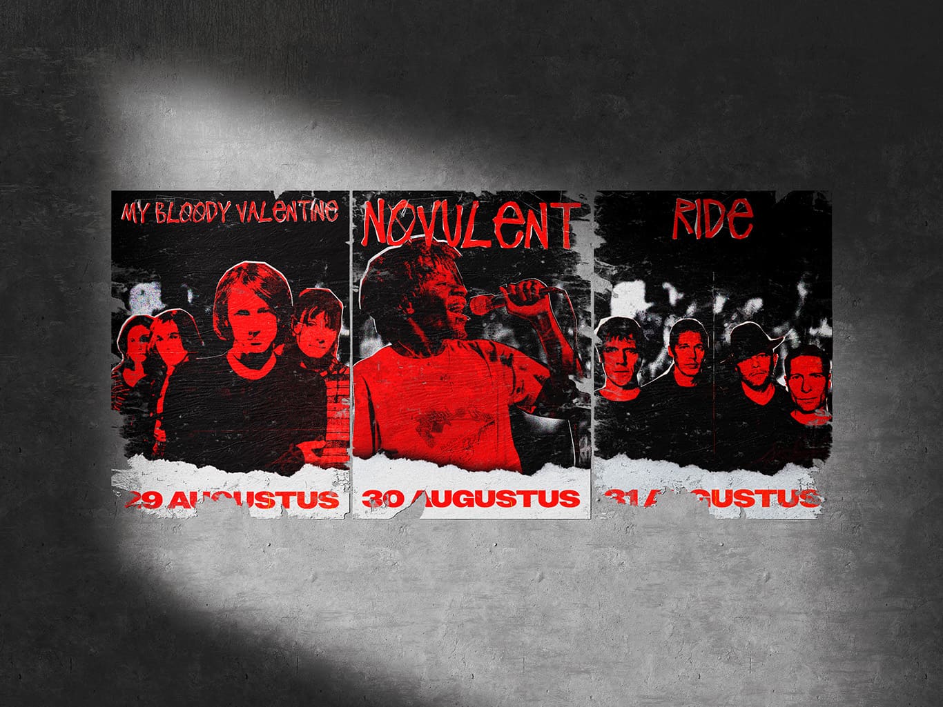
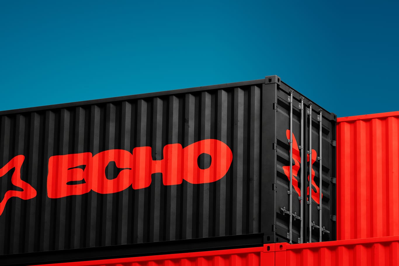
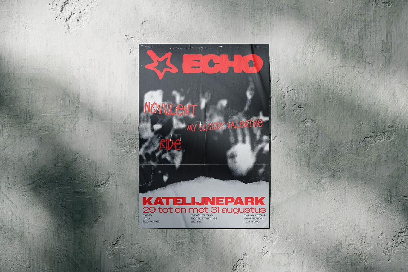
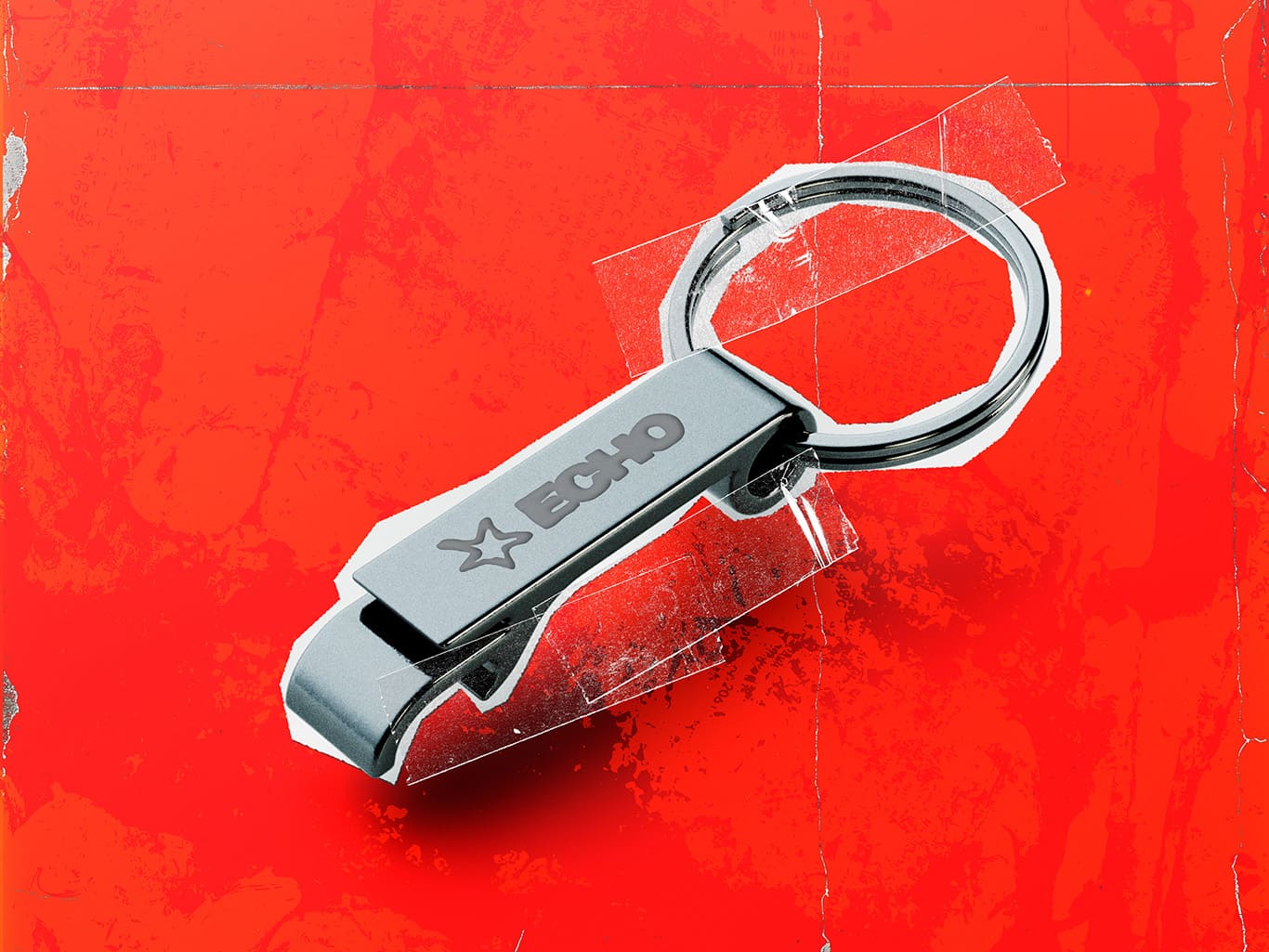
ECHO is a fictional festival set to take place in Katelijnepark, Bruges. It’s a tribute to the dreamy, layered sounds of shoegaze, indie pop, and alternative rock. ECHO brings generations together in a raw, creative, and immersive experience where music, art, and DIY culture collide. With bold visuals and a lineup of iconic and emerging artists, the festival lets the past echo into the present and inspire the future. ECHO’s mission is to offer a festival where shoegaze and alternative rock come alive. Through music, workshops, and a gritty visual identity rooted in DIY culture, it celebrates both nostalgia and innovation. Visitors don’t just watch, they become part of a living, artistic movement. The ECHO logo combines a wordmark with a hand-drawn star symbol, evoking the raw, DIY energy of garage bands and homemade flyers. It captures the handmade, authentic spirit at the heart of ECHO.
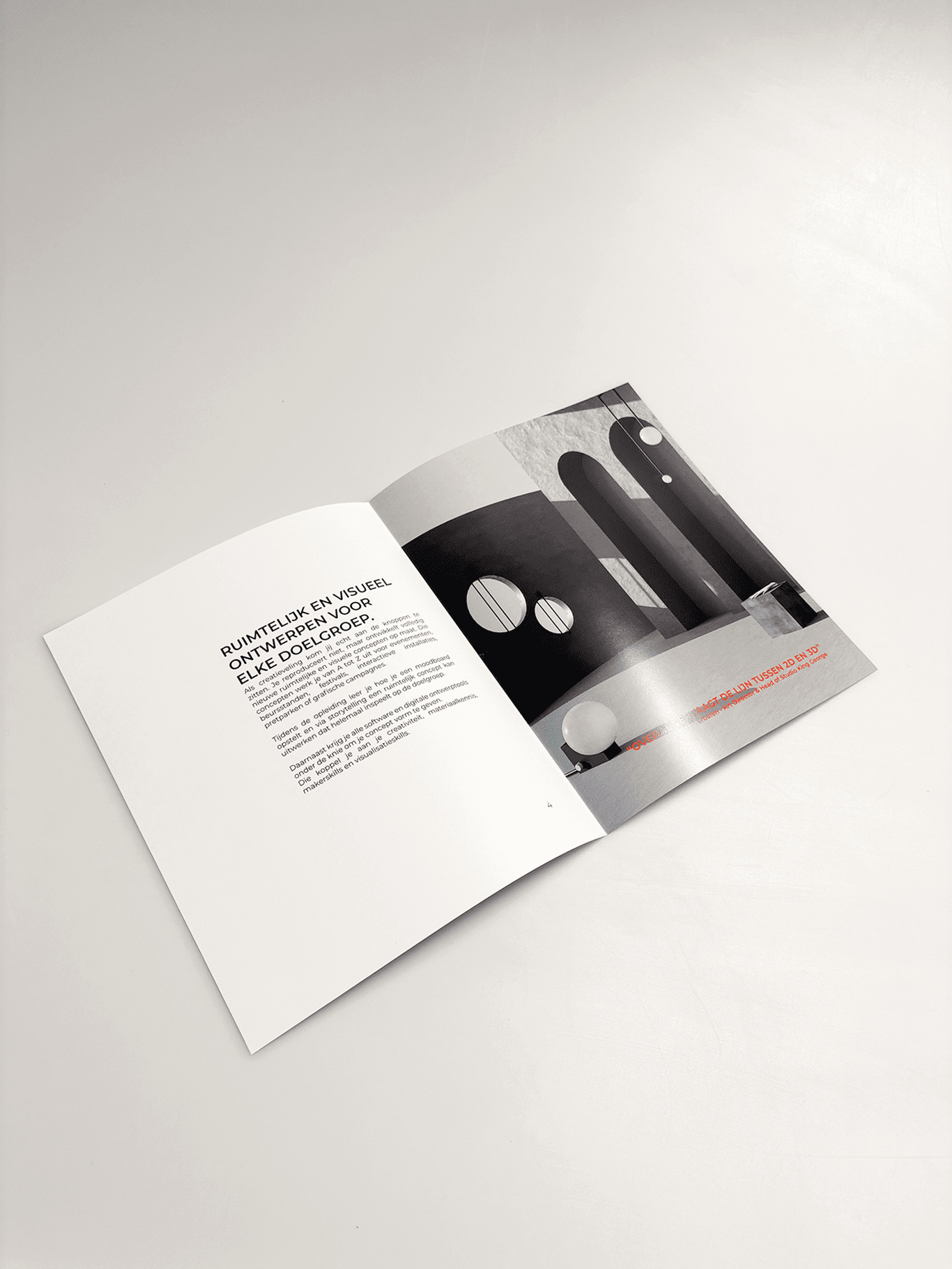
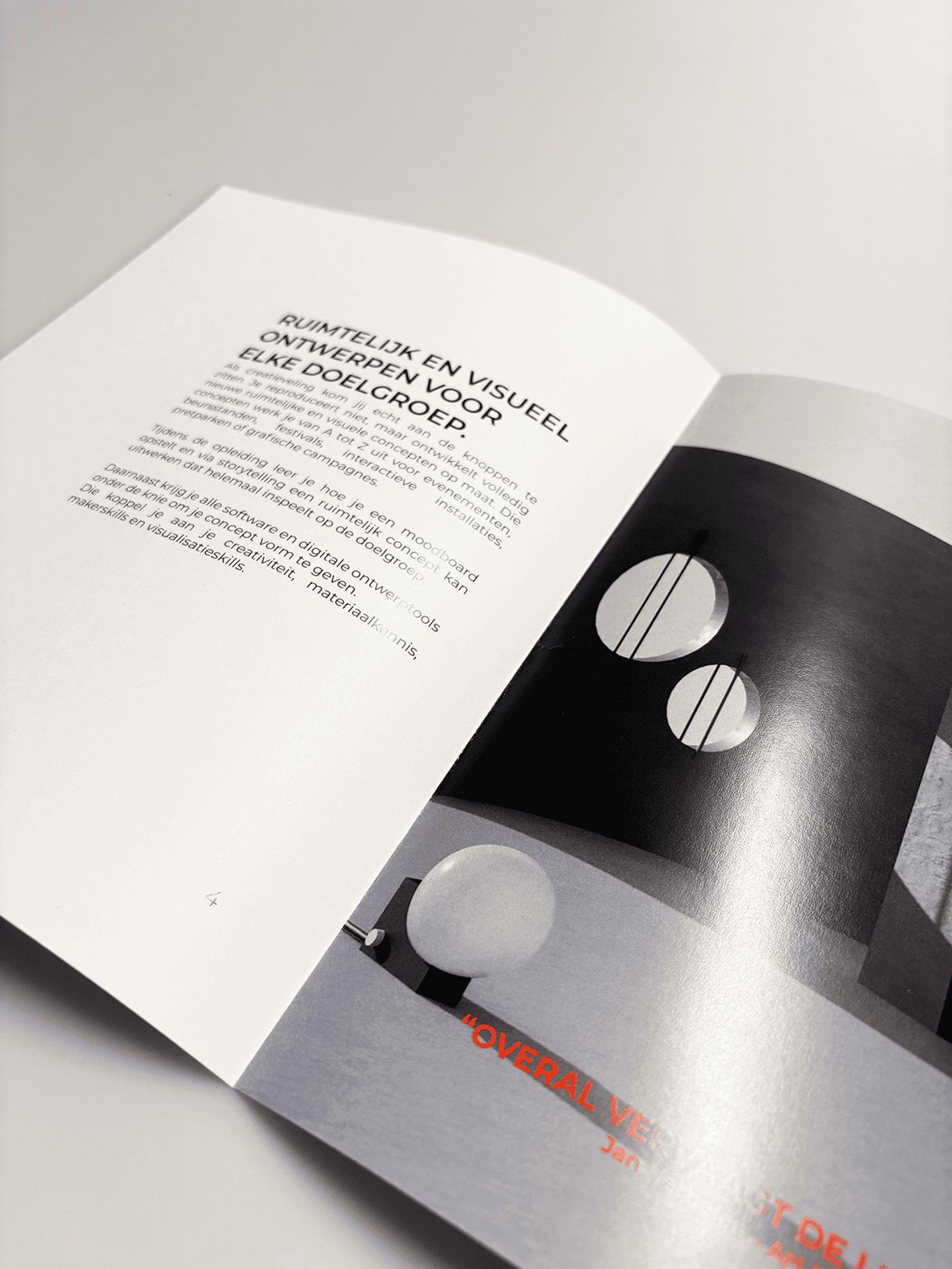
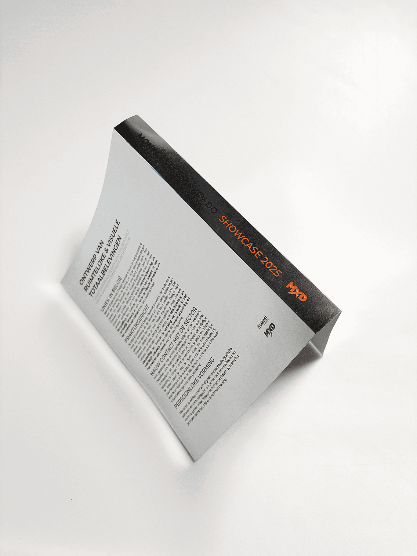
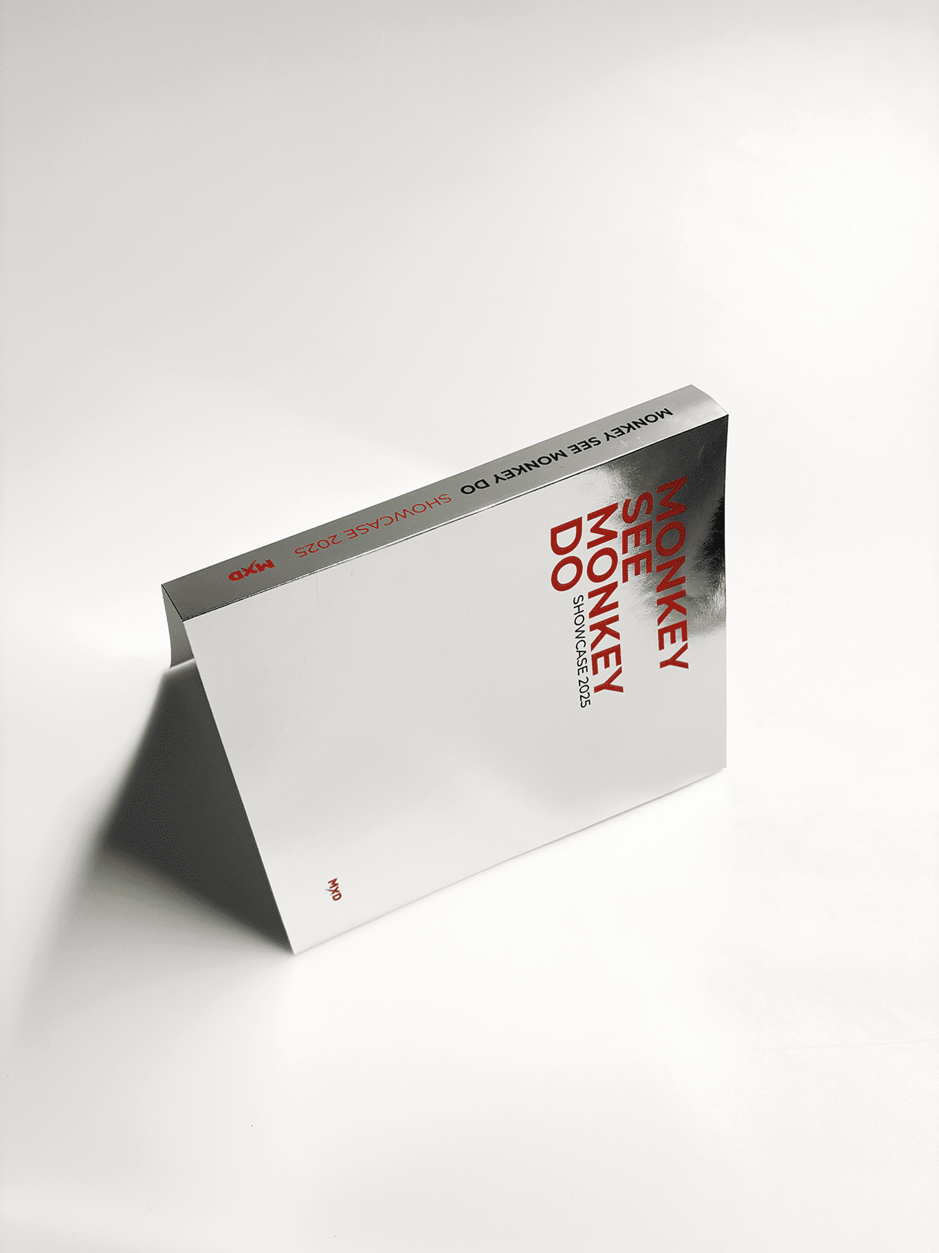
As part of my study program, I had to design a showcase magazine. I was given carte blanche, which meant I had full creative freedom to decide on the look and feel of the magazine. I went for a bold, industrial style because I feel it really reflects the character of my study program. The cover features thick orange lettering and has a glossy, eye-catching finish thanks to the use of silver foil. I also added UV spot printing to the main title, giving it a subtle shine that catches the light and adds extra impact.
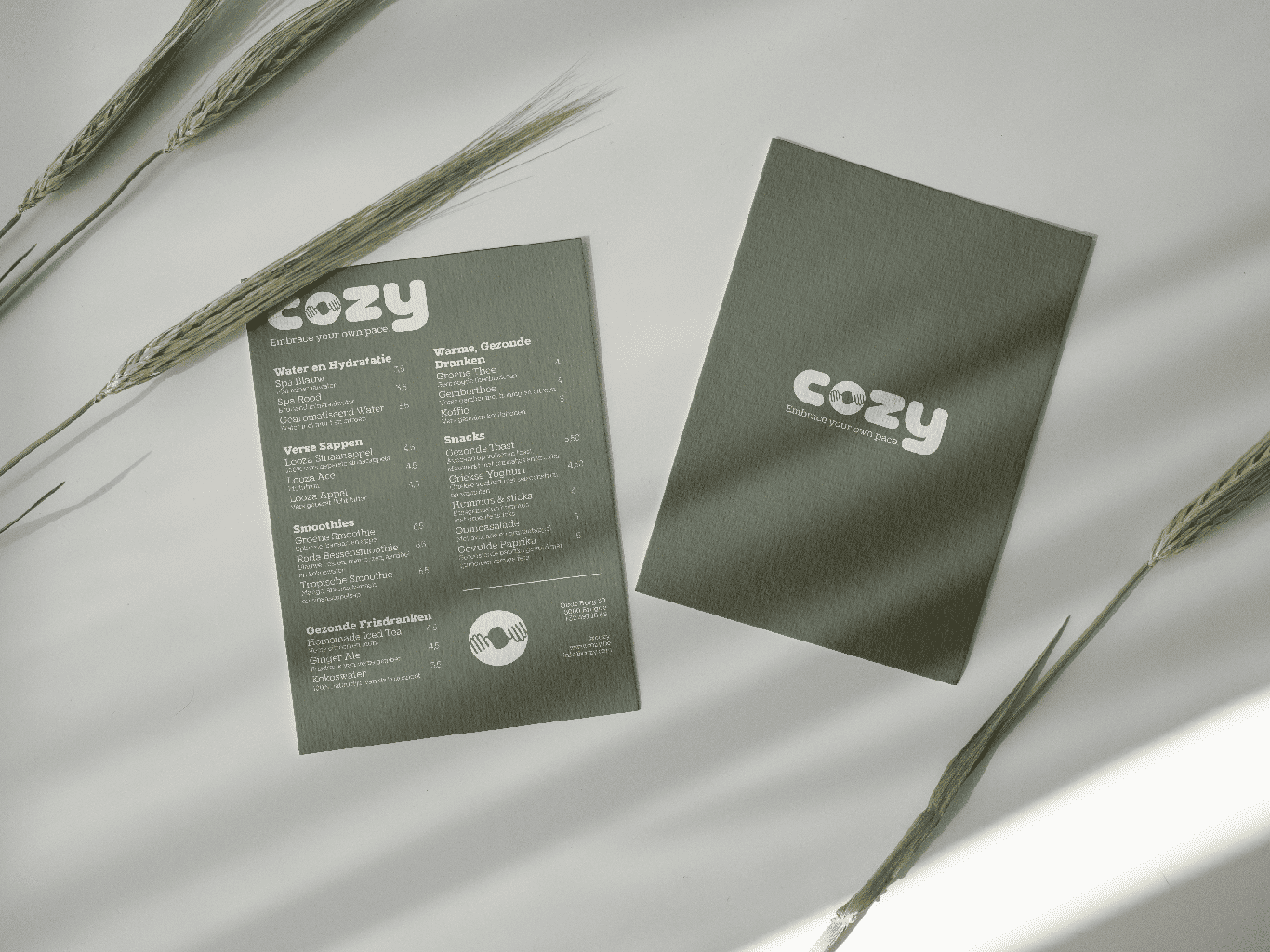
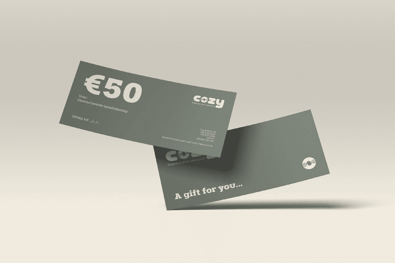
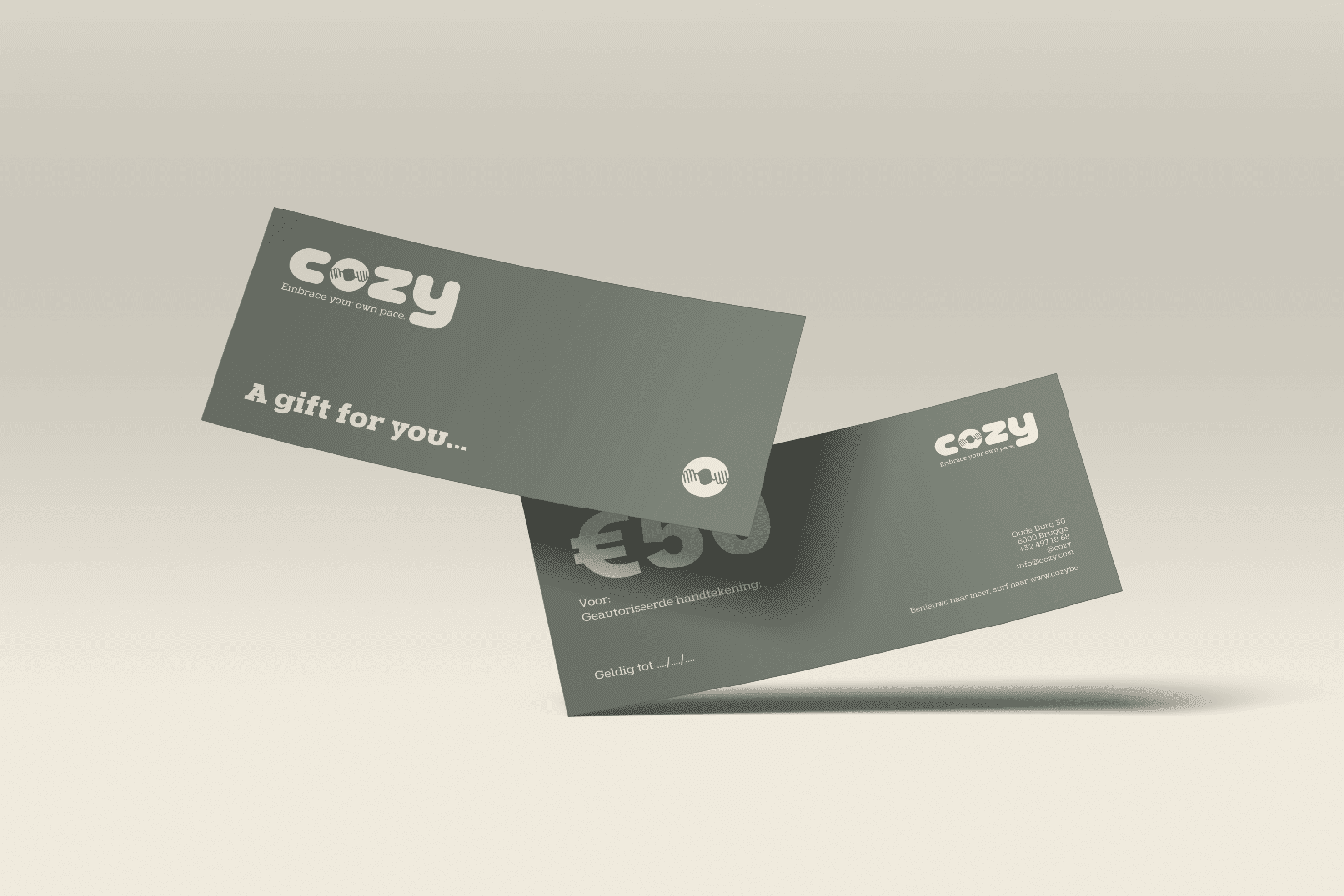
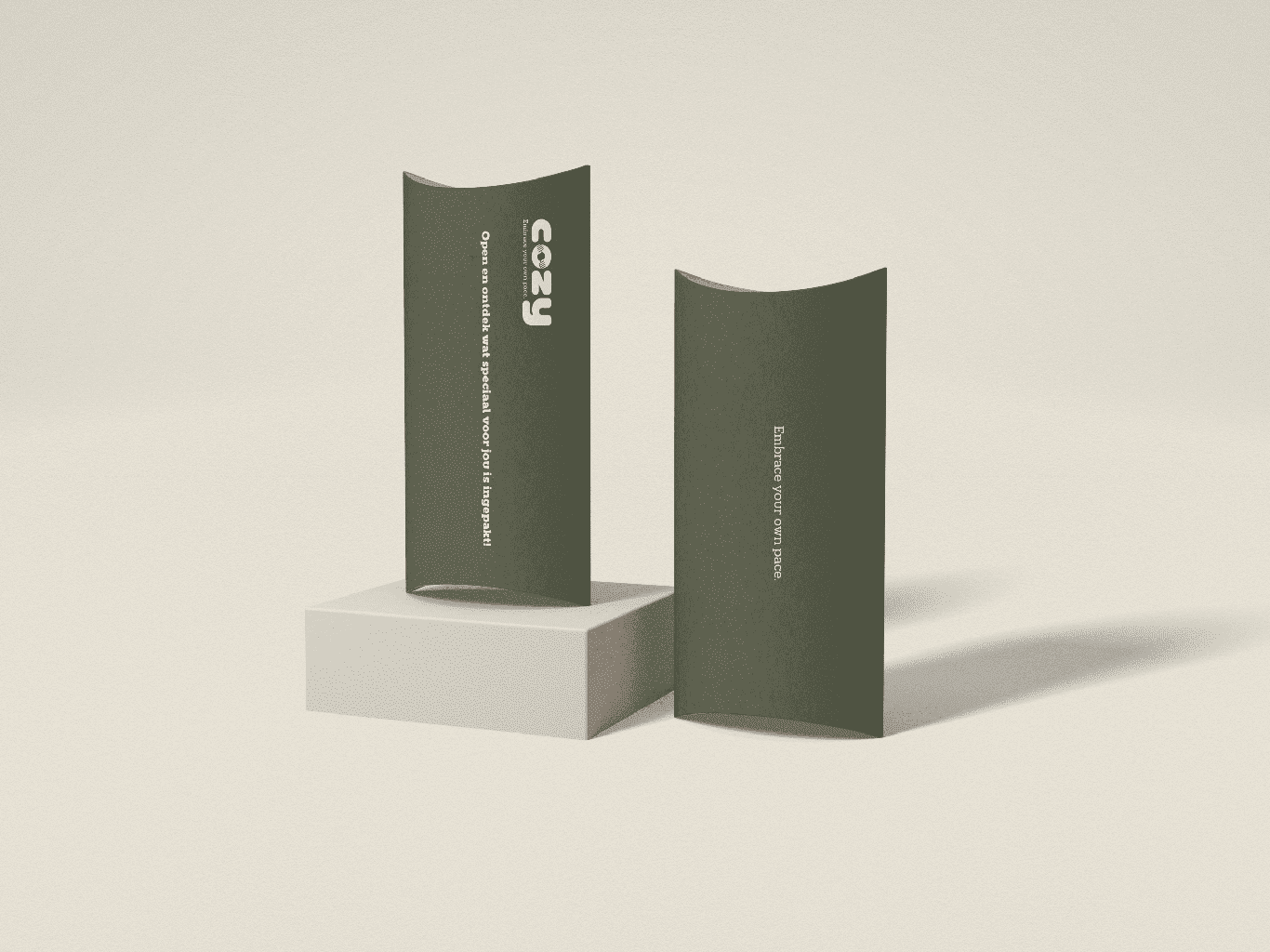
Cozy is a yoga and co-working space designed for young freelancers who are looking for balance between work and relaxation. It offers a calm, atmospheric environment to work with focus, free from distractions. In addition to workspaces, there is the “Cozy Zone” a place where you can relax, read a book or just to take a small nap. Cozy is the place where productivity and well-being come together. Cozy has a wordmark as its logo, with the symbol integrated into it. I chose to use rounded shapes in the wordmark, as they reflect the calm and relaxed atmosphere that Cozy represents. The symbol is the letter “o” from Cozy, in which two embracing arms can be seen. This visualizes the embrace between work and relaxation.